Conversion-Focused Website Design: What Actually Drives Leads
Six elements that turn a service-business website into a lead-generation engine, plus the warning signs your current site is leaking enquiries.
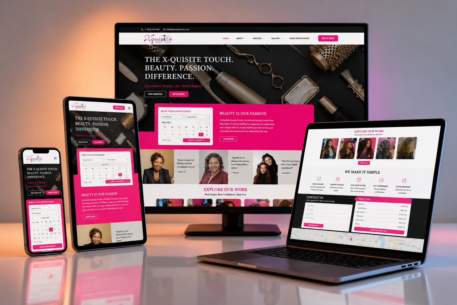
A beautiful website that does not convert is an expense, not an asset. Most service businesses do not have a traffic problem, they have a clarity problem. Visitors arrive, look around, and leave without knowing what to do next.
Conversion-focused website design fixes that by building every page around one question: what is the simplest next step this visitor can take? This guide covers the six elements that matter most, the warning signs your current site is leaking leads, and a five-week rollout plan.
What to build
Six elements of a conversion-focused website
Each one removes friction and replaces it with a clear path to action.
1. A single, obvious promise
The problem: Visitors land on a page and cannot answer the question: what does this company do for someone like me?
What we build: The headline states the outcome in the customer's language, the subheadline explains who it is for, and the call-to-action tells them exactly what happens next.
Clarity beats cleverness. Clear pages keep visitors and guide them toward action.
2. Social proof above the fold
The problem: People do not trust a business they have never heard of, so they bounce before reading the details.
What we build: Add logos of clients served, a short testimonial, or a metric like businesses helped within the first screen of the homepage.
Trust signals placed early reduce hesitation and increase scroll depth.
3. One primary action per page
The problem: Pages ask visitors to read, subscribe, call, chat, and buy all at once, which leads to no action at all.
What we build: Pick the one action that matters most for each page and make that button visually dominant. Secondary actions are styled as links or outlines.
Focused pages convert better because the decision is simpler.
4. Frictionless forms
The problem: Long forms with unnecessary fields kill enquiries. Every extra field is another reason to leave.
What we build: Ask for name, email, and one context question. Use progressive profiling to collect more details after the first conversation, not before it.
Shorter forms regularly lift conversion rates by 30% or more.
5. Mobile-first readability
The problem: Most B2B traffic now starts on a phone, but many sites still feel like desktop pages shrunk down.
What we build: Large tap targets, short paragraphs, collapsible sections, and fast-loading images make the site usable on small screens.
Mobile-friendly design improves both conversions and search rankings.
6. Speed and technical trust
The problem: Slow pages feel broken. Visitors assume a slow site means a slow company.
What we build: Optimise images, lazy-load below-the-fold content, use a fast host, and keep the layout stable as it loads.
Each second of load time improvement can lift conversion rates by several percentage points.
Signals
Signs your website is leaking leads
- Your homepage bounce rate is above 60%.
- Visitors scroll but rarely fill out the contact form.
- Mobile traffic converts at half the rate of desktop traffic.
- Your site describes features instead of customer outcomes.
- 1
Week 1: audit and messaging
We review analytics, heatmaps, and current copy to find where visitors drop off and rewrite the core message around customer outcomes.
- 2
Week 2: wireframes
We map the new page structure, navigation, and conversion paths before any visual design begins.
- 3
Weeks 3 to 4: design and build
The site is designed, developed, and tested across devices with tracking set up from day one.
- 4
Week 5 onward: measure and refine
We launch, watch real visitor behaviour, and iterate on headlines, CTAs, and form length based on data.
Pitfalls
Five mistakes that kill website conversions
- Designing for aesthetics before defining the conversion goal.
- Hiding the contact form behind multiple clicks or long menus.
- Using jargon-heavy headlines that mean nothing to a first-time visitor.
- Adding animations that slow load time and distract from the offer.
- Launching without analytics, so there is no way to know what worked.
FAQ
Common questions
Want a website that actually converts?
Book a free website audit. We review your current site, identify the biggest conversion leaks, and give you a redesign roadmap.
Keep reading
AI Agents
AI Agents for Business: What They Do and Where to Start
11 min read
AI Readiness
CRM and Knowledge-Base Cleanup Before AI Deployment: A Practical Guide
10 min read
Client Onboarding
Client Onboarding Automation: A Practical Guide
10 min read